
How to choose the perfect color combination.
Unlike most designers, I did not go to art school to study jewelry making. I had more of a traditional education earning a BA in Mass Communications and Advertising and continuing on to get a Masters in the same field. But my creative interests always stayed the course. My thesis, in fact was on The Emotional Response to Color in Fashion Advertising. I love color!
Being from Montreal, I went to Cegep, this is like a pre-University. There, I studied Creative Arts learning about many types of art forms, with my favorite being acrylic painting. I sometimes get the feeling that colors are speaking to me, but they don’t speak to everyone. If you struggle with trying to figure out how to put colors together to create eye-catching looks, or how to make your jewelry pop, listen up!
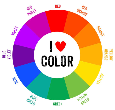
There is a simple tool that is very useful when trying to get inspired. A few years back, when I was teaching jewelry making to some students, I used this as the foundation of the course to help them make a well-balanced piece of jewelry. The beauty of this tool is that it can also be used for fashion, makeup, interior design, or any project where a color scheme is needed. I am talking about the color wheel.
Here are a few simple combinations that can be applied to your clothes and jewelry and so much more.
- Combine colors directly next to each other. Yellow and yellow-green, or Blue and violet, or one of my favorite red and red-violet.
- Colors that are directly across from one another tend to create the most pop. Yellow and violet, or red-orange and Blue-green, orange and blue.
- Forming a 90 degree angle with the color wheel also provides with great color combinations such as red-violet and orange, or green and yellow-orange, or blue and red-violet.
- Colors that form a "T" like red, blue-violet, and yellow-orange; or yellow, blue-green, and red-orange.
- Colors that form an "X" like orange, blue, yellow-green, and red-violet.
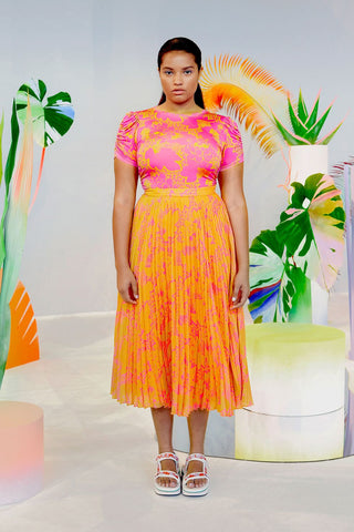
An example of orange and pink working together. Pink is a hue of red, which is next to orange on the color wheel.
Let’s talk about hues for a minute…a color’s hue is its placement on the color wheel. For example, there are many names for slightly different reds, such as burgundy, ruby, carnelian, rose, wine, brick…etc The same rules above apply for colors that are in the same color family. Therefore, any of these reds could pair well with greens.
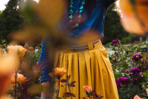
An example of yellow and blue working perfectly together.
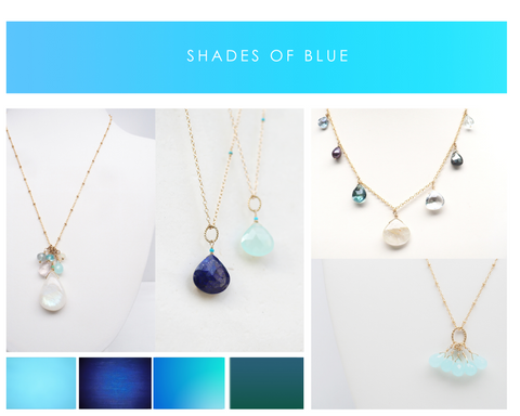
If you find yourself wearing something in golden tones, what color jewelry could you wear with it? If you guessed blue, you are now a color expert! I love blues for summer as it reminds me of the beach, you can find many pieces made of all shades of blue on my website right now, including amazonite, aquamarine, blue topaz, turquoise, and larimar. SHOP BLUES HERE.
So there you have it, have fun with colors and keep it simple. You don’t have to mix all the colors at once, perhaps start with variations of two or three. You are now ready to strike the perfect color balance.
Be Yourself. Feel Fabulous.
~Marianne
PS. If you enjoyed reading this, make sure to sign up to be part of The Fab Club to be the first to know about special events, promotions, shows, new content and much more. Click here and scroll to bottom of page to sign up:)
Leave a comment